CSS Only Loader
A warm and happy 2018 to all the dedicated followers of the KodeSmart Blog. The team here is very thankful for all the support throughout 2017 and we hope to have your continued support for this and the coming years. We are dedicated to writing and publishing even more content this year and we hope that you will continue to send us your requests for tutorials and reviews you’d like to see.
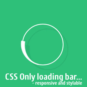
Today we are going to look at creating a custom loader using CSS Only. Most loaders and loading widgets are done either with JavaScript and or through the use of animated gifs. Since the advent of CSS3, many techniques once restricted to javascript frameworks such as jquery are now possible and actually quite easy to implement using CSS only. A few of the advantages of using just CSS to implement a loader includes built-in responsiveness, native look and feel including the ability to style on the fly.
HTML Code for the CSS Only Loader
<html>
<head>
    <link rel="stylesheet" href="style.css" type="text/css" media="all">
</head>
<body>
    <div class="loader" style="display:block;">
        <div class="loading"></div>
    </div>
</body>
</html>
THE CSS Animation
.loader {
	position: fixed;
	width: 100%;
	height: 100%;
	background-color: #ffffff;
	top:0;
	left: 0;
	z-index: 900000000;
}
.loader .loading{
	position:absolute;
	top:50%;
	left:50%;
	background-color: #ffffff;
	width:40px;
	height:40px;
	margin:-20px 0 0 -20px;
	border-width: 3px;
	border-style:solid;
	border-color:#000 #000 rgba(255,255,255,.5) rgba(255,255,255,.5);
	opacity:.9;
	border-radius:20px;
	-webkit-animation:rotate 1s linear infinite;
	-moz-animation:rotate 1s linear infinite;
	-o-animation:rotate 1s linear infinite;
	-ms-animation:rotate 1s linear infinite;
	box-sizing: border-box;
}
@-webkit-keyframes rotate{
	0%{-webkit-transform:rotate(0deg)}
	100%{-webkit-transform:rotate(360deg)}
}
@-moz-keyframes rotate{
	0%{-moz-transform:rotate(0deg)}
	100%{-moz-transform:rotate(360deg)}
}
@-o-keyframes rotate{
	0%{-o-transform:rotate(0deg)}
	100%{-o-transform:rotate(360deg)}
}
@-ms-keyframes rotate{
	0%{-ms-transform:rotate(0deg)}
	100%{-ms-transform:rotate(360deg)}
}
CONCLUSION
Using CSS only we are able to complete a clean, elegant and highly responsive loader. This loading icon can then be integrated seamlessly into any webpage or dialog.
Join the Newsletter
Sign up for our personalized daily newsletter
#1 GUIDE TO DRUPAL, WORDPRESS, CSS AND CUSTOM CODING | BEGINNER TO PRO