CSS3 Checkbox
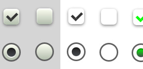
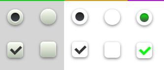
Check out these really cool css3 check box styles. Regular check boxes and radio buttons are dull, flat and boring, so why not use css3 to improve on visual aesthetics. Learn how to transform these HTML elements using css only.
The HTML for our Checkboxes
Here we go, very simple and straight forward: First we create a div container and add to it a standard checkbox and a label, pay close attention to the checkbox class as this will be used to style it.
<!-- CHECK BOX Circle -->
<div>
<input type="checkbox" class="ks_checkbox_ci" name="check" />
<label for="ks_checkbox_ci"></label>
</div>

<!-- CHECK BOX Square -->
<div>
<input type="checkbox" id="ks_checkbox_sq" name="check" />
<label for="ks_checkbox_sq"></label>
</div>
Styling Checkboxes using CSS
Using CSS3 we can set the size, shade and even apply a gradient background to our checkboxes. Here’s the css we applied to our checkboxes making them larger and more visually appealing, share your custom checkbox styles using the comments section below.
body {
background: #d6d6d6;
}

input[type=checkbox] {
visibility: hidden;
}

/* CHECK BOX Circle */
.ks_checkbox_ci {
width: 18px;
height: 18px;
background: #fcfff4;

background: -webkit-linear-gradient(top, #fcfff4 0%, #dfe5d7 40%, #b3bead 100%);
background: -moz-linear-gradient(top, #fcfff4 0%, #dfe5d7 40%, #b3bead 100%);
background: -o-linear-gradient(top, #fcfff4 0%, #dfe5d7 40%, #b3bead 100%);
background: -ms-linear-gradient(top, #fcfff4 0%, #dfe5d7 40%, #b3bead 100%);
background: linear-gradient(top, #fcfff4 0%, #dfe5d7 40%, #b3bead 100%);
filter: progid:DXImageTransform.Microsoft.gradient( startColorstr='#fcfff4', endColorstr='#b3bead',GradientType=0 );
margin: 20px auto;

-webkit-border-radius: 65px;
-moz-border-radius: 65px;
border-radius: 65px;

-webkit-box-shadow: inset 0px 1px 1px white, 0px 1px 3px rgba(0,0,0,0.5);
-moz-box-shadow: inset 0px 1px 1px white, 0px 1px 3px rgba(0,0,0,0.5);
box-shadow: inset 0px 1px 1px white, 0px 1px 3px rgba(0,0,0,0.5);
position: relative;
}

.ks_checkbox_ci label {
cursor: pointer;
position: absolute;
width: 10px;
height: 10px;

-webkit-border-radius: 55px;
-moz-border-radius: 55px;
border-radius: 55px;
left: 4px;
top: 4px;
}

.ks_checkbox_ci label:after {
-ms-filter: "progid:DXImageTransform.Microsoft.Alpha(Opacity=0)";
filter: alpha(opacity=0);
opacity: 0;
content: '';
position: absolute;
width: 10px;
height: 10px;
background: #222222;

-webkit-box-shadow: inset 0px 1px 1px rgba(0,0,0,0.5), 0px 1px 0px rgba(255,255,255,1);
-moz-box-shadow: inset 0px 1px 1px rgba(0,0,0,0.5), 0px 1px 0px rgba(255,255,255,1);
box-shadow: inset 0px 1px 1px rgba(0,0,0,0.5), 0px 1px 0px rgba(255,255,255,1);

background: -webkit-linear-gradient(top, #222 0%, #45484d 100%);
background: -moz-linear-gradient(top, #222 0%, #45484d 100%);
background: -o-linear-gradient(top, #222 0%, #45484d 100%);
background: -ms-linear-gradient(top, #222 0%, #45484d 100%);
background: linear-gradient(top, #222 0%, #45484d 100%);
filter: progid:DXImageTransform.Microsoft.gradient( startColorstr='#222', endColorstr='#45484d',GradientType=0 );

-webkit-border-radius: 55px;
-moz-border-radius: 55px;
border-radius: 55px;
top: 0px;
left: 0px;
}

.ks_checkbox_ci label:hover::after {
-ms-filter: "progid:DXImageTransform.Microsoft.Alpha(Opacity=30)";
filter: alpha(opacity=30);
opacity: 0.3;
}

.ks_checkbox_ci input[type=checkbox]:checked + label:after {
-ms-filter: "progid:DXImageTransform.Microsoft.Alpha(Opacity=100)";
filter: alpha(opacity=100);
opacity: 1;
}

/**********************************************************************************/
/* CHECK BOX Square*/
.ks_checkbox_sq {
width: 18px;
margin: 20px auto;
position: relative;
}

.ks_checkbox_sq label {
cursor: pointer;
position: absolute;
width: 18px;
height: 18px;
top: 0;
border-radius: 4px;

-webkit-box-shadow: inset 0px 1px 1px white, 0px 1px 3px rgba(0,0,0,0.5);
-moz-box-shadow: inset 0px 1px 1px white, 0px 1px 3px rgba(0,0,0,0.5);
box-shadow: inset 0px 1px 1px white, 0px 1px 3px rgba(0,0,0,0.5);
background: #fcfff4;

background: -webkit-linear-gradient(top, #fcfff4 0%, #dfe5d7 40%, #b3bead 100%);
background: -moz-linear-gradient(top, #fcfff4 0%, #dfe5d7 40%, #b3bead 100%);
background: -o-linear-gradient(top, #fcfff4 0%, #dfe5d7 40%, #b3bead 100%);
background: -ms-linear-gradient(top, #fcfff4 0%, #dfe5d7 40%, #b3bead 100%);
background: linear-gradient(top, #fcfff4 0%, #dfe5d7 40%, #b3bead 100%);
filter: progid:DXImageTransform.Microsoft.gradient( startColorstr='#fcfff4', endColorstr='#b3bead',GradientType=0 );
}

.ks_checkbox_sq label:after {
-ms-filter: "progid:DXImageTransform.Microsoft.Alpha(Opacity=0)";
filter: alpha(opacity=0);
opacity: 0;
content: '';
position: absolute;
width: 9px;
height: 5px;
background: transparent;
top: 4px;
left: 4px;
border: 3px solid #333;
border-top: none;
border-right: none;

-webkit-transform: rotate(-45deg);
-moz-transform: rotate(-45deg);
-o-transform: rotate(-45deg);
-ms-transform: rotate(-45deg);
transform: rotate(-45deg);
}

.ks_checkbox_sq label:hover::after {
-ms-filter: "progid:DXImageTransform.Microsoft.Alpha(Opacity=30)";
filter: alpha(opacity=30);
opacity: 0.5;
}

.ks_checkbox_sq input[type=checkbox]:checked + label:after {
-ms-filter: "progid:DXImageTransform.Microsoft.Alpha(Opacity=100)";
filter: alpha(opacity=100);
opacity: 1;
}
Join the Newsletter
Sign up for our personalized daily newsletter
#1 GUIDE TO DRUPAL, WORDPRESS, CSS AND CUSTOM CODING | BEGINNER TO PRO
