
Top Free & Open Source Data Visualization Libraries
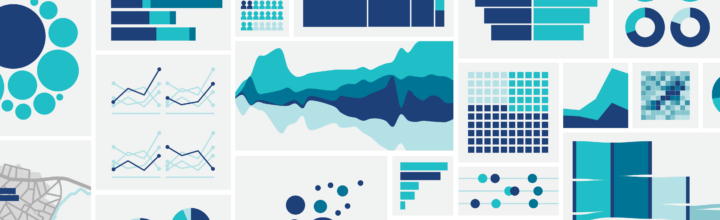
Data visualization transforms raw numbers into charts, graphs, and dashboards that are easy to understand. Whether you’re building a personal project, business dashboard, React application, or analytics platform, there are several excellent free and open source options to choose from.
Many people may wonder if libraries like these will eventually be displaced by AI. The reality is that charting libraries will remain completely practical and relevant. In fact, AI models will rely on these libraries far more than humans do, using them to present data in visually engaging ways to everyday audiences.
Why Use a Visualization Library?
Creating charts from scratch is time-consuming. Data visualization frameworks provide ready-made components, interactive features, responsiveness, animations, and export functionality so developers can focus on insights rather than drawing graphics manually.
1. Highcharts
Highcharts is one of the most mature charting libraries available. It supports a large collection of chart types including line, bar, pie, scatter, heatmaps, treemaps, and more.
Best for: Enterprise dashboards and professional reporting.- Large collection of chart types
- Excellent documentation
- Responsive and interactive
- Export charts to multiple formats
2. ApexCharts
ApexCharts focuses on providing beautiful default charts with a simple developer experience. It is lightweight, modern, and particularly popular for analytics dashboards.
Best for: SaaS products, admin panels, and reporting dashboards.- Modern visual appearance
- Easy learning curve
- Strong performance
- Good framework integrations
3. Chart.js
Chart.js is often the first visualization library beginners learn. It uses the HTML5 Canvas element and offers a straightforward API that makes creating charts quick and simple.
Best for: Students, beginners, and small web projects.- Very easy to get started
- Lightweight
- Clean documentation
- Animated charts by default
4. Apache ECharts
Apache ECharts is a powerful open source visualization platform capable of rendering advanced visualizations, large datasets, maps, network diagrams, and business intelligence dashboards.
Best for: Large-scale analytics and complex visualizations.- Rich feature set
- Advanced chart types
- Map visualizations
- Handles large datasets efficiently
5. Recharts
Recharts is a React-focused charting library built using React components and D3 under the hood. If your application uses React, Recharts offers a clean and declarative approach.
Best for: React applications.- React-native developer experience
- Declarative components
- Reusable charts
- Easy customization
Quick Comparison
| Library | Difficulty | Framework | Ideal Use Case |
|---|---|---|---|
| Highcharts | Beginner to Intermediate | JavaScript | Enterprise dashboards |
| ApexCharts | Beginner | JavaScript | Modern analytics apps |
| Chart.js | Very Easy | JavaScript | Learning and simple projects |
| Apache ECharts | Intermediate | JavaScript | Advanced visualizations |
| Recharts | Easy | React | React dashboards |
Side-by-Side Implementation Examples
The examples below render the same dataset using Chart.js, Highcharts, and ApexCharts. This makes it easier to compare syntax, configuration structure, and developer experience.
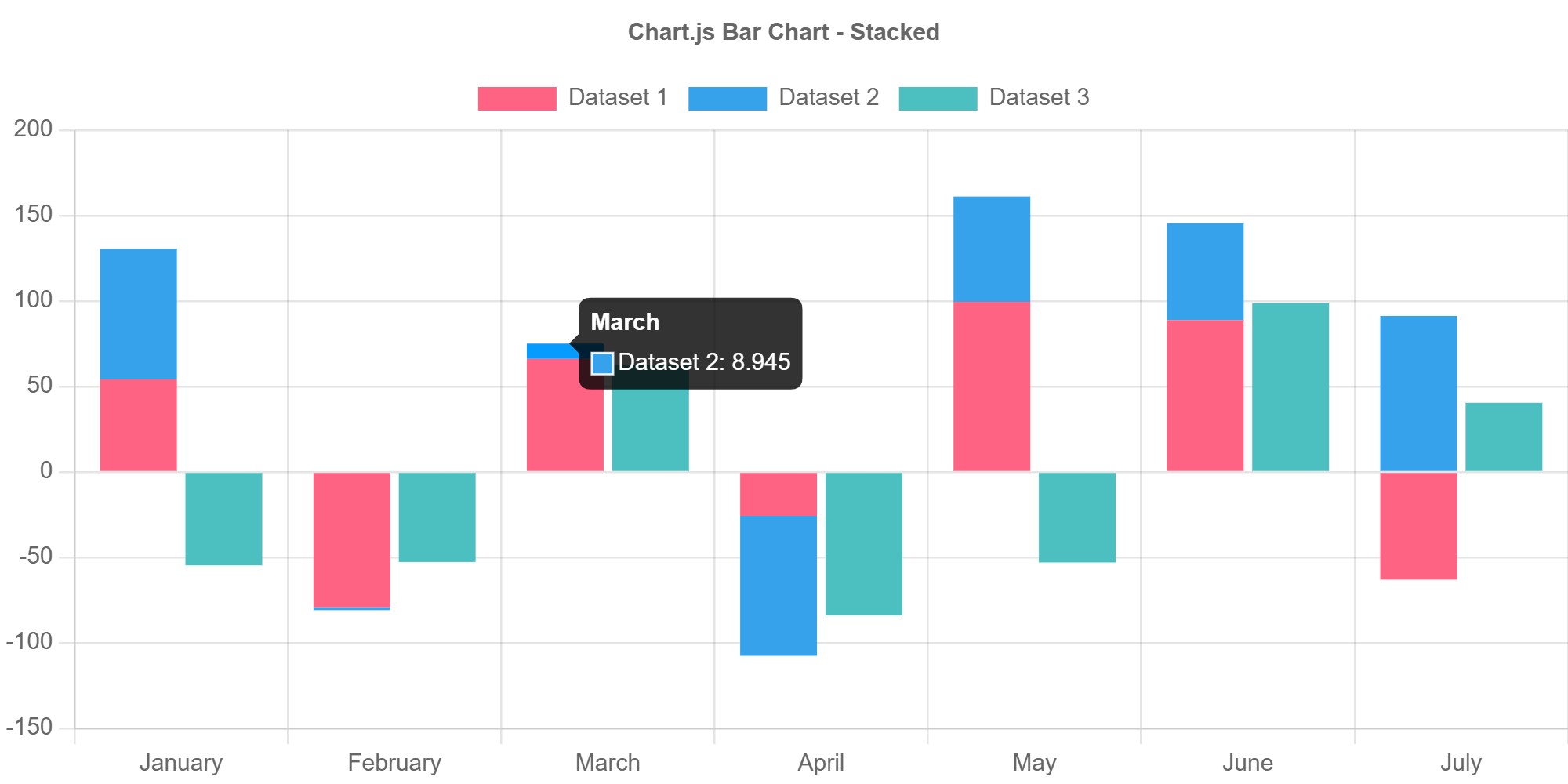
Chart.js
<canvas id="chartjsChart"></canvas>

<script src="https://cdn.jsdelivr.net/npm/chart.js"></script>

<script>
new Chart(
  document.getElementById('chartjsChart'),
  {
    type: 'bar',
    data: {
      labels: ['Jan', 'Feb', 'Mar'],
      datasets: [{
        label: 'Sales',
        data: [120, 190, 160],
        backgroundColor: '#3b82f6'
      }]
    }
  }
);
</script>
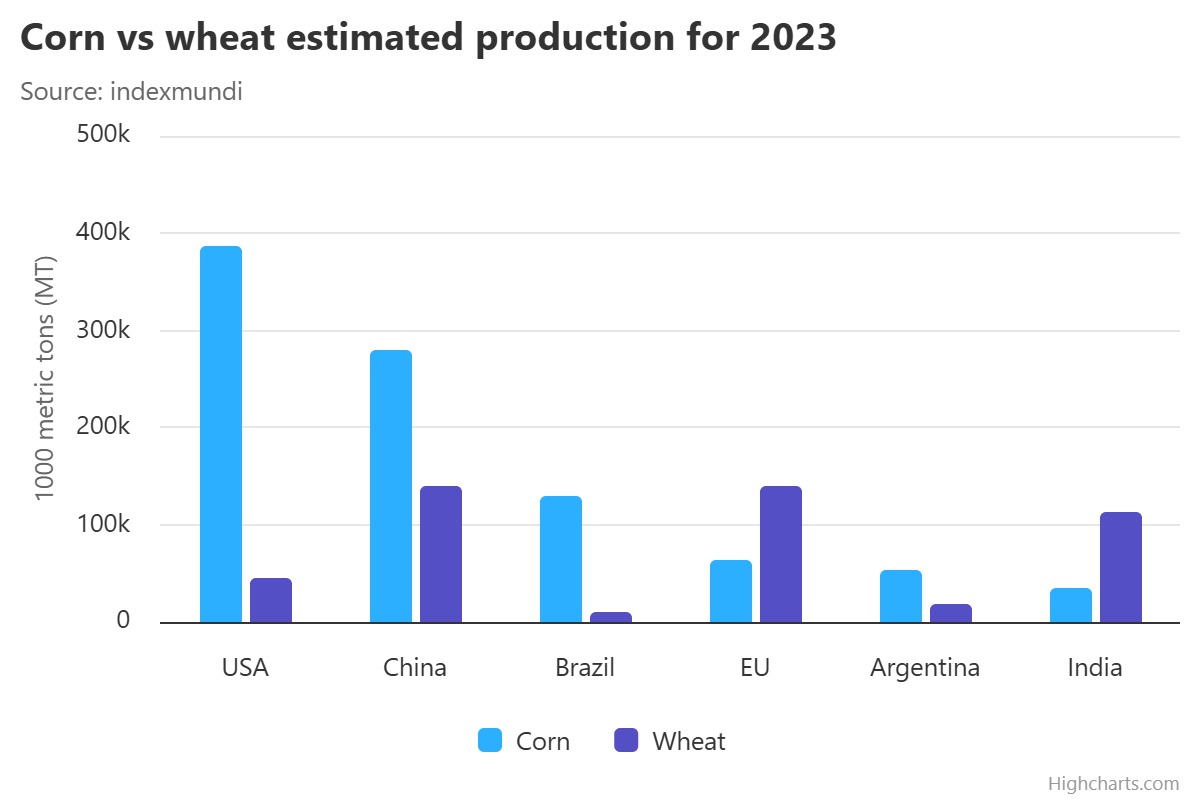
Highcharts
<div id="highchartsChart"></div>

<script src="https://code.highcharts.com/highcharts.js"></script>

<script>
Highcharts.chart('highchartsChart', {
  chart: {
    type: 'column'
  },
  title: {
    text: 'Monthly Sales'
  },
  xAxis: {
    categories: ['Jan', 'Feb', 'Mar']
  },
  series: [{
    name: 'Sales',
    data: [120, 190, 160]
  }]
});
</script>
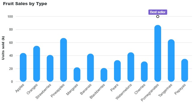
ApexCharts
<div id="apexChart"></div>

<script src="https://cdn.jsdelivr.net/npm/apexcharts"></script>

<script>
const options = {
  chart: {
    type: 'bar'
  },
  series: [{
    name: 'Sales',
    data: [120, 190, 160]
  }],
  xaxis: {
    categories: ['Jan', 'Feb', 'Mar']
  }
};

const chart =
  new ApexCharts(
    document.querySelector('#apexChart'),
    options
  );

chart.render();
</script>
Which Library Should You Choose?
- Choose Chart.js if you’re learning data visualization for the first time.
- Choose ApexCharts if you want attractive dashboard charts quickly.
- Choose Highcharts for feature-rich business applications.
- Choose Apache ECharts for advanced visual analytics and large datasets.
- Choose Recharts if your project is built with React.
For most beginners, Chart.js and ApexCharts provide the fastest path to building professional-looking charts, while Apache ECharts offers the greatest flexibility for complex visualization requirements.
Join the Newsletter
Sign up for our personalized daily newsletter

#1 GUIDE TO DRUPAL, WORDPRESS, CSS AND CUSTOM CODING | BEGINNER TO PRO



Leave a Reply